A2 Production; SWITCH

Wednesday 19 January 2011

Q4. How did you use new media technologies in the construction and research, planning and evaluation stages?

We used new media for the construction of our main product as we had a Canon XHA1 camera that we used to actually film our coursework.
However, we also used still cameras for the research process too. This was so we could experiment with interesting shots and trigger our creativity for when it came to actually filming. We focused on cinematography using still images so that when we used the Canon camera during production our composition could be a lot more interesting. We also used this technique during the planning stages of our film because once we had planned a story and drawn up a storyboard, we could then venture out onto location and take pictures using still cameras to generate a photo storyboard. This proved to be valuable because it saved time on the actual day of filming; we already knew which shots looked good via the photo storyboard.
Throughout all the stages of production, we used an online blog in order to produce innovative work that shows our ability to work with new technologies alongside our individual creativity; and we’re still using it now. We used this to our advantage because even though we work in groups to produce our film, the blog is our tool to present how much effort and knowledge we have personally put into it. As well as this, using an online blog instead of a log book meant that we could access it from any computer and therefore reduced possible limitations. This brings me to the use of the internet - the most predominantly used technology for all stages of production. We were constantly researching about all aspects of our coursework; themes of the fall, existing examples of interesting ways to use a camera, existing double acts etc. The use of the internet was a very valuable technology that helped us every step of the way. Another way in which we used the internet was to find soundtrack for our film. Obviously we used the sound equipment whilst filming for ambient sounds but for non diegetic soundtrack we had to download copyright free tracks from the internet. Furthermore, popular sites such as youtube.com, kizoa.com and slideshare.com meant that we could present our research as innovatively as possible. Posting clips of films/director interviews to back up our own ideas and making slideshows of images rather than posting endless pictures onto the blog. It demonstrated student initiative and confidence with technology we may not necessarily use everyday.
During the construction of the ancillary tasks I predominantly used Photoshop for my posters and a word document for my review. I was already comfortable using Photoshop due to my experience at GCSE and so this gave me an advantage to add effects and write on the image I used for my poster adverts. I used the eraser to remove the existing license plate and then added my own text to it instead. Additionally, my review was set out to look like an existing magazine review and I thought the simplest way to do this was by using a word document as I am very aware of the functions and options available to me on word. This proved to be easy for me as I used text boxes to single out columns on a page, and I could copy and past images from the internet to be pasted with that film review.
Adobe Premier Pro is the software we used to edit our film. This technology allowed us to digitise our rushes taken on location and sort them on a timeline for us to begin piecing our film together. Not only did the software let us sort through our film but it also allowed us to add effects, slow down or speed up the duration of scenes and let us add titles of text to illustrate which day it was. We incorporated numerous dip to black effects that we used for transitions into other scenes. Additionally, at the end we even used a dip to white for when Frank blows flour into Big Pete’s face. As well as this, after receiving our audience feedback we used technology to improve the film. We originally had the switching of the briefcase in black and white but we took this effect off when one audience member couldn’t work out what was in the briefcase. The software made it really easy for us to make changes as the tools were easy to find. Aspects like this enabled us to produce a successful final film and even if we didn’t use some of the effects we tried out, the technology helped us experiment with what worked and what didn’t. To conclude, we constantly used technologies even when we weren’t filming, and all of the technologies we did use, we benefited from.

Q3. What have you learned from your audience feedback?

Throughout the editing process of our film we received comments and feedback from our target audience so that we could constantly improve it. However, in order to make the final product successful it was necessary to receive feedback at all stages of production. So in order to make our progress as valuable as possible we got outsider opinions on all of our treatments, storyboards, scripts and ancillary tasks.
Our initial idea for a film was a very dark and twisted story about an alcoholic father who was seen as a hero in his sons’ eyes. However, after pitching this idea to our classmates and our teacher we took their feedback into consideration and re thought our decisions. They made comments such as, “it’s just another story about an alcoholic” and “it’s a story but where is the depth?” These comments really set us back and knocked our confidence in it because if our target audience didn’t like the idea of it in the beginning why would they like the final product; it wasn’t worth making. So from this audience feedback we learned that we needed to come up with a better idea or else our final film wouldn’t have been appealing at all. So back to the drawing board we went and we decided to look at the theme of the fall from another angle. Rather than making a typical tragedy we wanted to make a comedy. This would challenge all stereotypes of what “the fall” really means and would be something unique. After all, we were all aiming for something that has never been done before. So we used a similar style of story as famous Director Guy Ritchie and generated a new film idea based on two best friends trying to make money quickly in order to buy a car.
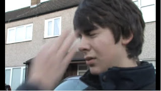
After writing a completely new treatment and scripts to accompany it, we pitched this second idea to our classmates and teacher again and the feedback was a lot more positive. Individuals made comments like, “the idea is simple yet effective” and others “really liked the double act.” One issue we had was generating ideas to show the double act trying to make money. They would first try and sell cookies because Charlie ate one right after they found the car for sale. After that scene we had to somehow represent Charlie pretending to be blind so that they could beg for money, claiming it was for charity. However, we didn’t know how to illustrate this in a way that was funny but not unrealistic. We originally had one of the door to door cookie customers punch him in the face for being forceful with cookie sales, but our classmates soon pointed out that was “very abrupt” and “out of the blue.” So we suggested having Frank flick him in the eye instead, for eating more cookies and ultimately eating the profits. Due to the honest feedback they gave us we were able to save the film from losing its comedy. All of the feedback we received from both pitches helped us to decide that this double act /comedy/ mobster film would be our final idea and we could therefore finalise our treatment and begin drafting a storyboard. Using the audience feedback from our pitch, as a group, we knew that having such a simple film idea meant we would have to present it in a very interesting way. So each shot started off as just an idea of what to show that was necessary to be communicated to the audience but then we thought of the most appealing way to present it. For example, using split screen to show the double act being turned away from door to door cookie sales. Once we completed the storyboard we showed it to members of our class to see if they could follow the story easily as well as find it pleasing to the eye. They gave us positive feedback such as, “the over the roof shots using the car can make the beginning of the film funny introduce the humour.” In addition to this, numerous students stated “the over the shoulder laughing shots in the hotel room would really set the scene and make the double act feel uncomfortable.” So we unanimously decided to finalise the drawn storyboard and progress to the photo storyboard so we could see, in person, which shots worked and which didn’t. We didn’t feel the need to receive feedback from this as we knew from previous feedback that the storyboard was successful and the shots were interesting, the photos were more for our benefit and preparation for filming. Once we had done this, we knew the shots that worked and the ones that didn’t so all that was left was to actually film!
The next lot of feedback that we needed from an audience was during the editing process of our film. This helped us to constantly change and improve scenes to our target audience’s preferences. We screened our film to some students of ages 15 and 16 to ensure they understood it, as well as to gain comments on what they actually thought of it. They all agreed that, overall, the production was very good and a very fun watch. However, there were technical aspects that needed to be dealt with. For example, one of the viewers said they couldn’t tell what was in the briefcase at first as we had the shot in black and white. When we changed the scene to colour, they could see the purple £20 notes with a typical red band around them and they realised.
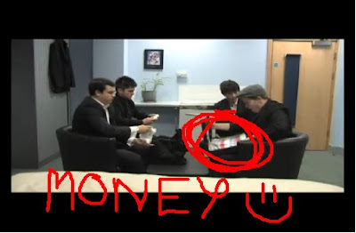
Here is a snapshot of the scene we originally had in black and white. I've edited it myself to highlight where the money is and how much clearer the money is because it is in colour. So this helped us to make the storyline clearer. It also helped us to analyse the film as if we had never even heard of it; because we knew the story so well, and knew how we wanted the film to look we had to make sure that people who hadn’t been told what the film is about could still understand. So each time we came to edit we had to try with fresh eyes. In addition to this, one of the 16 year olds said that the end scene felt very triumphant because of the music we used. We learned from this because we weren’t actually 100% sure of what soundtrack fitted the ending best however she confirmed that for us. Furthermore, a few viewers commented that some scenes were way to long than they needed to be. This was especially true for the dialogue screens we had made to illustrate the conversation between the double act and the bodyguard, so this helped us to cut time out as well as prevent our audience from getting bored waiting for something to happen. This was also an issue for the toilet scene. The double act had to wait outside the cubical for a long time because the actor playing the bodyguard took a while to come out during filming. We resolved this issue, thanks to their feedback; by speeding up the duration of the shot so that our audience didn’t get bored waiting for something to happen.
The ancillary tasks were vital to the campaign of our film as in the real world, advertisements would be used to promote the film and attract an audience’s attention. It’s the one chance the production team get to make a first impression, so for mine I knew i had to carefully think of what elements of the film I wanted to include. After producing one still advert, I asked numerous peers to comment on it giving me strengths and weaknesses. From this I could then produce another poster of a similar house style but using their advice I could make it better than the first. Not only did I receive feedback and comments from fellow classmates but I also presented my ancillary tasks to friends outside of my media course, to get a more well rounded idea on how an audience would respond to my adverts in the real world. They said things such as “I can see it’s a mobster movie!” and by this I knew I had to create a poster that was funnier so not to lose the comedic side of the production. This helped me to create a new one that illustrated the double acts facial expressions, which one friend then said “It’s like gangsters gone wrong?” proving I had captured the atmosphere I wanted.
Altogether my feedback helped me to make three posters that represent the film well. This is because each one had a different feel to it even though they belonged to the same film. I was able to portray strict gangster behaviour in the first and second poster but incorporate more of a comedic edge to the third one. This would not have been possible without the audience feedback I received.
Overall I found audience feedback very valuable in order for me to improve my work. Not only did it advise me of how to make my work better individually, but it actually influenced final ideas within the group too; thus proving its importance through stages of production.

Q2. How effective is the combination of the main product and ancillary tasks?

The combination of our main product and the ancillary tasks for our coursework is to show how well we know our film as well as how creative we can represent it through a poster and review. In the real world, this combination would be the campaign for the product and ultimately the distribution stages of a film. The ancillary tasks consisted of three film posters carrying a house style and a review of the film based on the layout and language of existing film reviews. Both the poster and the review work as essential marketing tools for any film institution as it is a chance to reveal a feel for the film before it is released. In the poster you communicate the genre and target an audience in order to generate hype for your product. The review also does this by informing readers what worked well and what could have been done better; so they have these opinions in mind before they even go to see the production.
When I had to design the posters for my film I had to keep in mind the genre and key themes so I could accurately communicate this to my target audience. I researched existing films relative to my genre of film to see how they managed to get across the message of their film. One of the posters I researched was for the film “The Other Guys” and here I found that the film is a comedy and this was portrayed through the image of two men frozen in the frame, firing their guns and being blown away from an explosion in the background. This helped me to come to the realisation I needed to balance comedy with the essence of a mobster movie; just how “The Other Guys” balanced comedy with action. In order to do this I constructed a campaign using three different pictures I took at an organised photo shoot, and edited them to become my posters, representing different themes of my film in each one. The first one illustrated a car with two men standing in front of it exchanging a briefcase. The headlights are shining behind their legs and the way I have positioned the frame only reveals the characters from the waist down. This is to uphold the mysterious mobster element as you haven’t been introduced to the characters through the poster. In addition to this, I knew that the whole point of the film was for the double act to get money to buy this car. So I believed it to be vital to include the car in the poster. I used this to my advantage by editing the word SWITCH into the license plate of the car. This really influenced the gangster feeling as opposed to the funny side of the production. However, I created another poster that has the double act leaning on the car that is positioned central in the frame, with the prop of the briefcase in between them and you can see their facial expressions. Frank looks smug and confident as he is the man with the plan whilst Charlie’s face demonstrates his shock at how much money they now have. This focuses more on the comedic element of the film. Both of these posters portray elements of our film and I think they would gain audience appeal for those interested in my genre. In addition to this, there is a clear house style running through my posters as this indicates to an audience that although the posters are slightly different images, they still belong to the same production. Both posters show the car which is an essential aspect of our film and both posters have two characters and a briefcase in the frame. It’s more the way I have staged each element that makes them clearly different. The first poster I didn’t show the characters faces; just them exchanging a briefcase with their other hands in their pockets – hence the gangster feel. The other poster I showed their facial expressions which demonstrated comedy. This was vital in communicating to the audience that the film has different aspects to it whilst clearly demonstrating a thread between them.
When constructing my review I had to consider the purpose of them generically and then I apply this to my own production. I had to highlight what worked well or not so well, highlight the actors in the film, refer to technical aspects and give an overall rating. For audience purposes, I had to inform them of what the film is about so that they can get an idea of whether or not they’ll be interested in going to watch it. I praised the casting of the double act and compared them to existing double act “Laurel and Hardy” so the reader could relate to an existing example. I also commented on the clever narrative of the film that is nonlinear. This indicates to the reader/future audience that the story is told in chronological order after revealing part of the ending at the beginning. I researched existing layouts of magazine reviews before formatting my own and decided to use Empire Film Magazine as my inspiration. I did this because I know that Empire Magazine is highly credited and popular for film reviews and when looking at a copy of it I saw a review that reminded me of my own film. It was a review for “Due Date” starring Robert Downey Jr and Zach Galifianakis as a kind of double act trying to get home via a long road trip. This influenced me to use an Empire magazine layout because my film is similar to an existing one that features in this existing magazine. I used a snapshot image from my film as the image to accompany the review and this shows the double act trying to sell cookies during Day 1 of “Switch.” This immediately communicates humour to the reader before they’ve even read the review. Furthermore, the language I used was informative in light of the film however it was typical review wording with clever phrases and taglines. I did this to stick to the conventions of a review as well as inform the reader of the clever concepts in the film. As well as this, the actual page layout I re created for my own film had four other film reviews on it. So I successfully pasted them into my own review to format the page in a way that looked realistic to Empire Magazine.
The actual film itself is an effective marketing tool as without it there wouldn’t be a purpose for a campaign! The film consists of themes such as comedy, gangsters, money, and friendship. The posters illustrate these themes thus proving their relationship. The combination of the film and ancillary tasks compliment each other to sell as a package and entice the target audience. Furthermore, the institution uses this campaign to generate a fan base. In the same way Hollywood Blockbusters produce posters, reviews, merchandise etc. they create an interested audience that will become loyal to the film. By creating posters that portray the film successfully, I have created recognisable images that an audience will always associate with my film. Even after they have seen it, fans will want to purchase a poster as merchandise, just how the real and existing industry works. This is how the film and ancillary tasks work together.

Q1. In what ways does your media product USE, DEVELOP or CHALLENGE forms and conventions of real media products?

The genre of our film “SWITCH” is primarily comedy however it also combines subsidiary themes that uses and develops the expected conventions of a comedy film. By this I mean it is amusing like all comedies are expected to be however certain elements give the film another depth to it. The story is based on a double acts quest to get money quickly and the comedic side to the film is illustrated through the ridiculous scenarios they get themselves into. For example, two fully grown men going door to door to try and sell cookies in order to raise enough money for a car; it’s so stupid it’s funny!
However, combining this with the themes of drugs as well as the mobster atmosphere created through the exchange of drugs for money; our film includes elements of a typical comedy but develops this to give the film an additional tone. This is present in the existing product of Guy Ritchie film “Snatch.” This film follows gangster-like characters all trying to find the location of a very valuable diamond. However, through dialogue and the way certain characters are created, the film has a strong element of humour. In addition to this, the characters of our film Frank and Charlie were inspired by existing characters of Derek and Rodney Trotter (Only Fools and Horses) combined with Lloyd and Harry otherwise famously known as dumb and dumber. Using these characteristics for the profile of our own characters makes them unintelligent but willing to con for money. This enforces the almost dark humour that is illustrated in our media product.
The narrative style of our film is nonlinear and we did this to cause confusion at the beginning so the audience will want to keep watching. Additionally, telling the story out of chronological order makes the viewing more interesting, especially seeing as there were numerous plot points in our film; starting with scenes from the ending and then explaining how they got there was the best way to link comedy with the gangster element. It added a level of sophistication to the film. In doing this we challenged the conventions of an ordinary comedy film. Existing media products that have a nonlinear narrative are popularly action films such as Tarantino’s Kill Bill, Pulp Fiction and also Frank Miller’s Sin City. All of these films show vital information or events at the beginning to go on to explain these within the rest of the film. However, where our film is a different genre to the usual nonlinear narratives we have challenged the convention in a way where it still works well. In addition to this, we developed an idea from well-known CSI programmes to use screens that read Day 1, 2 and 3 alongside the time at which the scene is set. This idea was generated by the text that usually accompanies a scene where the location has to be established; like they do on crime investigation programmes. However, we implicated this method to show the day and time rather than the location and therefore developed its initial purpose to one that suited our film. This was fundamental for our audience to understand the structure of the story as well as split the scenes up realistically to show the characters’ situations on separate days.
The technical aspects we used for the duration of our film are very similar to existing ones. The effects we used for our opening sequence are similar to the ones used in the previously mentioned film “Snatch” however we developed it to be original and more appropriate for our production. By this I am referring to the frame holds used to introduce the characters of Snatch that we then used but developed because we used a vital scene from the end of our film rather than snippets of characters that flow into others, like Snatch does. We used the frame holds for the beginning whilst Frank and Charlie are running and we held the frame on each character to present their names as well as the title of our film: SWITCH. Another technical aspect we used was split screen. We incorporated this twice in our film; once that served the purposes of a split screen and also once that challenges it. The whole point of a split screen is to show different occurrences that all link or flow from one to another. For example, in the hit teen-comedy “Mean Girls” a split screen is used to illustrate a four way conversation.

This was an innovative way to show all four conversations on one screen so the audience can understand who says what to which character. It’s quick and clear to see what is happening. We used this idea to show three different doors being slammed in Frank and Charlie’s faces after customers refused their cookies. This compliments the codes and conventions of real media products as the split screen was used to show numerous linked incidents interestingly. The second time we used split screen challenged its conventions as we applied it to the hotel room scene where Big Pete and his Bodyguard are laughing, which consequently makes our double act laugh nervously. We showed images of the same room but the pairs of people in separate screens to indicate the difference between them. Big Pete and his Bodyguard clearly have the power and authority as once they stopped laughing so did Frank and Charlie. This was made clearer through the use of split screen.
The most significant use of sound and image relationship in our film is the “Superbad” inspired snippet that illustrates our double acts change of costume. This short scene presents a slow motion track of the double act walking towards the camera with slick 70s style non diegetic sound playing, whilst on screen you can see the pair dressed in formal suits. This idea was used because of clip from Superbad that shows Seth and Evan, two best friends from the film, getting off a bus dressed ready to go to a party with swanky non diegetic sound to accompany it. All illustrated in slow motion as well. This follows the conventions as it is funny to see the double act trying to act better then what they really are. Their body language in the way they walk, and their facial expressions demonstrating their confidence also adds to the humour. Additionally, the characters’ costume, hair and make up used the conventions of existing media products. Towards the end of our film when all four characters are in the hotel room, they are all dressed in suits. This is the climatic part of the film where the final attempt to make money becomes successful in the exchange of fake drugs for £6000. The fact that they are wearing formal suits and present themselves to be well groomed when they are actually dabbling in dodgy dealings follows the conventions of a typical gangster style movie. This is also used in the iconic Academy Award winning film, The Godfather. The way ‘The Mafia’ and their morals are captured in the film is similar to ours as they present themselves respectfully but their actions and way of life is not respectful at all. Overall, through characterisation, narrative, sound and mise en scene of our film I am confident in saying we have followed conventions of real media products as well as develop and challenge concepts of existing media products. As well as this, these aspects have represented how much we have grown from AS level work to A2.

Tuesday 4 January 2011

Outsider comments

In order to have a varied opinion of my posters i asked numerous friends of mine who are not media students to tell me what they think. They gave me valuable feedback as they hadn't yet viewed the finished film so just like in the real world; they would get a feel of the film through the posters alone.

Olivia French - "i can see by the first one its got a gangster feel to it, but then the third poster looks funny because of the character's facial expressions. Is the film about cars?"

Millie Crowley - "The second one is my favourite because the image links with the title. The two people in the picture are obviously switching something and the title of the film is called switch so i think you cleverly linked the image with the film title."

Jack De Looper - "This looks like a film i'd enjoy watching. Its got a breifcase and cars - seems like my kind of movie!"

George Rowden - "From the first and second poster i get an essence of mystery about what actually happens in the film but then the third poster communicates comedy to me? All three combined seem to give a kind of mobster film but one that's funny. Like gangsters gone wrong or something?"

Wednesday 15 December 2010

Sharon's Comments

Poster 1: I really like the composition and symmetry of the image. I like the way you have taken advantage of certain elements in the picture, like the car headlights by editing it the way you have. You have experimented with the location of the title on the page which I felt was very clever and the tagline is really good also. In terms of target audience you can look into adding features that may appeal them i.e. the light bulb without making any drastic changes. There is not much shown in terms of the main two characters but having said this I still feel the poster works well plus you have another poster with the characters faces shown it in. Overall you have done a really good job well done!!

Film Review: A very professional layout, the housing style you were influence by has been shown very clearly good job. The language style you have used is typical of what you would find in a magazine from Empire so that has also been executed well. In terms of improvements I honestly cant fault it so I don’t know what to add :S . . .Good Job!!

Rebecca's Comments

Posters

Great stuff, I think it really suits your genre. The use of the two main characters on the poster, but not fully in view was a good idea. It gives the audience an impression of the story along with the car and suitcase but doesn’t reveal too much. My only feedback would be to maybe make something more of the font, perhaps a more styled font? Or different fonts for the title, and then the actors etc. And include the production details? That you find at the bottom of posters? Unless you haven’t seen it used on your genre research. Overall they fit a great house style, although I think the black and white effect with the graininess makes it difficult to make out the pictures, so maybe edited them so there clearer?

Review

What can I say, you’ve stuck to empires layout and style, with other films which you’ve made reviews for, all good stuff. The font size is a bit small, and the spacing seems odd, maybe try putting your work into PowerPoint or another programme so you can fix the layout better?