Poster 1: I really like the composition and symmetry of the image. I like the way you have taken advantage of certain elements in the picture, like the car headlights by editing it the way you have. You have experimented with the location of the title on the page which I felt was very clever and the tagline is really good also. In terms of target audience you can look into adding features that may appeal them i.e. the light bulb without making any drastic changes. There is not much shown in terms of the main two characters but having said this I still feel the poster works well plus you have another poster with the characters faces shown it in. Overall you have done a really good job well done!!
Film Review: A very professional layout, the housing style you were influence by has been shown very clearly good job. The language style you have used is typical of what you would find in a magazine from Empire so that has also been executed well. In terms of improvements I honestly cant fault it so I don’t know what to add :S . . .Good Job!!
Wednesday, 15 December 2010
Rebecca's Comments
Posters
Great stuff, I think it really suits your genre. The use of the two main characters on the poster, but not fully in view was a good idea. It gives the audience an impression of the story along with the car and suitcase but doesn’t reveal too much. My only feedback would be to maybe make something more of the font, perhaps a more styled font? Or different fonts for the title, and then the actors etc. And include the production details? That you find at the bottom of posters? Unless you haven’t seen it used on your genre research. Overall they fit a great house style, although I think the black and white effect with the graininess makes it difficult to make out the pictures, so maybe edited them so there clearer?
Review
What can I say, you’ve stuck to empires layout and style, with other films which you’ve made reviews for, all good stuff. The font size is a bit small, and the spacing seems odd, maybe try putting your work into PowerPoint or another programme so you can fix the layout better?
Tuesday, 14 December 2010
Cast List
FRANK - Ashley Walker
CHARLIE - Jack Glister
BIG PETE - Lewis Plaster
BODYGUARD - Matthew Partlett
CHARLIE - Jack Glister
BIG PETE - Lewis Plaster
BODYGUARD - Matthew Partlett
Props List
There are numerous props needed to indicate the correct genre of our film:
BRIEFCASE FULL OF MONEY
FAKE DRUGS (actually bags of flour and sugar)
BLINDFOLD
POT OF MONEY FOR FAKE CHARITY
A CAR
FOR SALE SIGN (for the car)
EMPTY CAN
COOKIES/TRAY
BRIEFCASE FULL OF MONEY
FAKE DRUGS (actually bags of flour and sugar)
BLINDFOLD
POT OF MONEY FOR FAKE CHARITY
A CAR
FOR SALE SIGN (for the car)
EMPTY CAN
COOKIES/TRAY
The Storyboard for "SWITCH"
Slideshow: Storyboard - Slideshow
Here is our finalised storyboard.
All images were drawn by Yasmin Philgence but we were all there to construct it.
Monday, 13 December 2010
Guy Ritchie Films
The initial inspiration for our film is very similar to the styling of Guy Ritchie directed productions. Audiences who like the films he makes would be interested in our film as they share similar themes.
This is the trailer for the film "Snatch" directed by Guy Ritchie and this is the feel and style we hope to lace our film with. The comedic-gangster production is original and i think would be very fun to work with. The main challenge i can see coming with making a film like this is the fact that a lot of the comedy comes from the dialogue E.g. The irish accent of Brad Pitt not being understood. Yet we cannot use techniques like this as our film has to be silent. None the less, this is our strongest idea and i am really looking forward to making it.
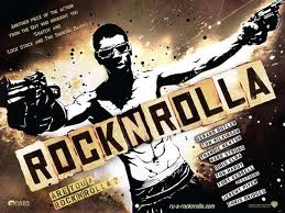
Alongisde this film is Rock N Rolla also directed by Guy Ritchie. This has the same Ritchie stamp on it as it is a story about a real-estate scam putting millions of pounds up for grabs, attracting some of the city's scrappiest tough guys and its more established underworld types; all of whom are looking to get rich quick. The fast paced mobster atmosphere is present and the fact that the story follows criminals trying to get rich quick, it links to themes of our own film.
The main difference is that our film will not contain blood, guns and violence so it still opens the target audience for a wider market.

This is the trailer for the film "Snatch" directed by Guy Ritchie and this is the feel and style we hope to lace our film with. The comedic-gangster production is original and i think would be very fun to work with. The main challenge i can see coming with making a film like this is the fact that a lot of the comedy comes from the dialogue E.g. The irish accent of Brad Pitt not being understood. Yet we cannot use techniques like this as our film has to be silent. None the less, this is our strongest idea and i am really looking forward to making it.
Alongisde this film is Rock N Rolla also directed by Guy Ritchie. This has the same Ritchie stamp on it as it is a story about a real-estate scam putting millions of pounds up for grabs, attracting some of the city's scrappiest tough guys and its more established underworld types; all of whom are looking to get rich quick. The fast paced mobster atmosphere is present and the fact that the story follows criminals trying to get rich quick, it links to themes of our own film.
The main difference is that our film will not contain blood, guns and violence so it still opens the target audience for a wider market.
Sunday, 12 December 2010
"The Hotel Room"

We were lucky enough to gain access to a room withing the school that was equipped with desks, chairs, a sink and a cabinet that we could disguise as a wardrobe. This meant that we wouldn't have to go to an actual hotel to get the shots we could just make a few minor adjustments to the office we have and it will look like a hotel suite. The picture above is what the room looked like originally; papers all over the desks with the computer on show a quite a few chairs.

Here are the table and chairs where the "SWITCH" will take place and we arranged the desks in a way that once a duvet cover was placed over them, it would appear to be a bed! These elements made our set look a lot more realistic.

This is the finished room from a different angle illustrating the sink and table to still give off a hotel room essence. In addition to this, on the left hand side are two cabinets that we have hung a blazer on to make it look like a wardrobe. Below is a clearer example of this. (with Esther sitting on the cupboard!)

Below was the final picture i took that included all of the elements that made the room more believable to be a hotel. The only thing missing is the bed but we don't want to get too clear a shot of it anyway because if it becomes noticeable that it isn't an actual bed, that will ruin the production value of our film!

Experimental Stills
These are images Yasmin and i took whilst on location so we could have an idea of what kind of shots we can get on the day of filming. This saved time and reinforced our creativity.


Target Audience
The target audience for our film is obviously a vital part of its success and needs to be clear. First of all, due to the fact there is the theme of drugs in our film i don't think it would be suitable for younger ages. Not just because it's a corrupt message but also because they wouldn't understand the point of us using this plot point. i would say from 12-80 years old would be appropriate and where our film will hopefully be a clever collaboration of gangster and comedy, Guy Ritchie fans will be targetted indefinitely.
The kind of typical person to be interested in our film would be a young male who loves Only fools and horses but is also a fan of hit Brit film Roack N Rolla. Although, having said this i believe females would enjoy our film too as it will hopefully be more funny than focused on drugs. We plan to emphasise more the silly situations the double act get into rather than them actually selling fake drugs!
The kind of typical person to be interested in our film would be a young male who loves Only fools and horses but is also a fan of hit Brit film Roack N Rolla. Although, having said this i believe females would enjoy our film too as it will hopefully be more funny than focused on drugs. We plan to emphasise more the silly situations the double act get into rather than them actually selling fake drugs!
Changing our film idea
Our original group idea was a dark story based on an alcoholic father driving his wife away from the family but the story would be told/seen through the eyes of their son.
Once we received our feedback from Miss Nair as well as our classmates, myself, Yasmin and Sharon felt really disappointed with the reaction. Our teacher thought and said we could do a lot better and suggested we work on the plot points of the film.
Although we walked away completely disliking the idea altogether. So we started to think of a new one! At the beginning of the coursework when we found out we would be making a film on the theme of the fall - everyone assumed it had to be dark and miserable as "the fall" isn't a very positive subject. This is how we generated ideas for "SWITCH." A Guy Ritchie inspired film that we would make comedic along with a clever storyline. We all agreed this would be a lot more creative as oppose to the typical "drunken dad" kind of story.
My Thoughts On Cinematography
The cinematography of a film is (in a nutshell) the make up and general look of it. If a films' cinematography is presented in a boring, dull way the film isn't going to LOOK interesting.
So i went out in search of objects and opportunities to take really interesting pictures that LOOK good, in the hope that when it comes to the making of my film i can be prepared to avoid using boring, usual shots and angles.
So i went out in search of objects and opportunities to take really interesting pictures that LOOK good, in the hope that when it comes to the making of my film i can be prepared to avoid using boring, usual shots and angles.
Wednesday, 8 December 2010
My Final Posters

This poster shows a lot of key aspects to the film and is effective in the sense that an audience seeing this would unsderstand its message to giving the film a gangster tone. Using a briefcase full of money, a car and two men in suits screams clever con film so i feel i successfully portrayed this via this poster.
My Final Posters

This poster idea is very similar to my first one except it is more zoomed in. I decided to use this as the lighting is a lot darker on this poster because the headlights have been cropped out. This then focuses on what is actually happening between the two characters and emphasises their exchange.
My Final Posters

This illustrates the car the double act wish to purchase alongside two men exchanging a breifcase. Within this poster i have demonstrated a gangster atmosphere as well as use a tagline that highlights a key theme of the film. Emphasising the idea that Frank and Charlie are not the brightest bulbs yet they have a bright idea.
Tuesday, 7 December 2010
PICTURES FOR CREDITS
These are numerous snapshots i took for the ending of our film while the credits roll. This was inspired from the ending of the film "The Hangover" and is a clever way to inform the audience of what actually happened to the characters. The film tells the audience that they got the money and these pictures illustrate how they spent it!
This is a small clip from the credits mentioned above and below are the pictures we wish to use for our own film.


This is a small clip from the credits mentioned above and below are the pictures we wish to use for our own film.


Film Poster Research

The above poster is for the film 'Snatch' directed by Guy Ritchie. This typical gangster layout is authentic and traditional however may be a bit too simple for our film. On the other hand, the characters Frank and Charlie are very simple minded so it could possibly work to compliment elements of the film.

This poster is for the film 'Dumb and Dumber' and captures the same friendship Frank and Charlie have. The only main exception is that this poster depicts just how stupid the characters are where as Frank and Charlie are a bit smarter than that.
Thursday, 2 December 2010
Film Review

This is my final review page. A re-creation of a layout used in Empire Magazine. This is 100% original and i created it using a word document.
Subscribe to:
Comments (Atom)